Installation
Install from GitHub:
# install.packages("devtools")
# devtools::install_github("temuulene/mongolstats")
Your First Analysis: Infant Mortality Trends
Let’s walk through a complete workflow using infant mortality data—a key indicator of population health and health system performance.
Step 1: Load Packages
library(mongolstats)
library(dplyr)
library(ggplot2)

# Set language to English for readable output
nso_options(mongolstats.lang = "en")

# Set global ggplot2 theme with proper margins to prevent text cutoff
theme_set(
  theme_minimal(base_size = 11) +
    theme(
      plot.margin = margin(10, 10, 10, 10),
      plot.title = element_text(size = 13, face = "bold"),
      plot.subtitle = element_text(size = 10, color = "grey40"),
      legend.text = element_text(size = 9),
      legend.title = element_text(size = 10)
    )
)
Step 2: Find the Right Table
Search for infant mortality data:
# Search by keyword
mortality_tables <- nso_itms_search("infant mortality")
mortality_tables |>
  select(tbl_id, tbl_eng_nm) |>
  head(5)
#> # A tibble: 5 × 2
#>   tbl_id            tbl_eng_nm
#>   <chr>             <chr>
#> 1 DT_NSO_2100_014V1 NUMBER OF INFANT MORTALITY, aimags and the Capital and by m…
#> 2 DT_NSO_2100_014V2 NUMBER OF INFANT MORTALITY, by soum, district and by year
#> 3 DT_NSO_2100_014V4 INFANT MORTALITY, by sex, by soum, and by year
#> 4 DT_NSO_2100_014V5 INFANT MORTALITY RATE,  per 1000 live births, by sex, by so…
#> 5 DT_NSO_2100_015V1 INFANT MORTALITY RATE, per 1000 live births, aimags and the…
We’ll use DT_NSO_2100_015V1 - Infant Mortality Rate per
1,000 live births (Monthly).
Step 3: Explore Table Metadata
Before fetching data, check what dimensions are available:
# View table structure
meta <- nso_table_meta("DT_NSO_2100_015V1")
meta
#> # A tibble: 2 × 5
#>   dim    code  is_time n_values codes
#>   <chr>  <chr> <lgl>      <int> <list>
#> 1 Region Бүс   FALSE         28 <tibble [28 × 3]>
#> 2 Month  Сар   FALSE        120 <tibble [120 × 3]>

# Check available months
time_vals <- nso_dim_values("DT_NSO_2100_015V1", "Month", labels = "en")
head(time_vals, 10)
#> # A tibble: 10 × 2
#>    code  label_en
#>    <chr> <chr>
#>  1 0     2025-12
#>  2 1     2025-11
#>  3 2     2025-10
#>  4 3     2025-09
#>  5 4     2025-08
#>  6 5     2016-01
#>  7 6     2016-02
#>  8 7     2016-03
#>  9 8     2016-04
#> 10 9     2016-05
Step 4: Fetch Data
Get national infant mortality rates for the past two decades:
# Get all month codes
months <- nso_dim_values("DT_NSO_2100_015V1", "Month", labels = "en")

imr_national <- nso_data(
  tbl_id = "DT_NSO_2100_015V1",
  selections = list(
    "Region" = "0", # National level
    "Month" = months$code
  ),
  labels = "en" # Get English labels
)

# Preview
imr_national |>
  head(10)
#> # A tibble: 10 × 5
#>    Region Month value Region_en Month_en
#>    <chr>  <chr> <dbl> <chr>     <chr>
#>  1 0      0        13 Total     2025-12
#>  2 0      1        13 Total     2025-11
#>  3 0      2        11 Total     2025-10
#>  4 0      3        14 Total     2025-09
#>  5 0      4        16 Total     2025-08
#>  6 0      5        12 Total     2016-01
#>  7 0      6        13 Total     2016-02
#>  8 0      7        14 Total     2016-03
#>  9 0      8        15 Total     2016-04
#> 10 0      9        15 Total     2016-05
Step 5: Visualize the Trend
Create a publication-ready plot:
# Prepare the data for visualization
# Step 1: Convert month strings to proper dates for time series plotting
# Step 2: Filter to recent decade (2015-2024) for clear trend visibility

p <- imr_national |>
  mutate(date = as.Date(paste0(Month_en, "-01"))) |>  # convert "YYYY-MM" string to Date
  filter(date >= as.Date("2015-01-01") & date <= as.Date("2024-12-31")) |>
  ggplot(aes(x = date, y = value, group = 1)) +
  geom_line(color = "#2c3e50", linewidth = 1, alpha = 0.3) +  # dim raw data so trend stands out
  geom_point(color = "#e74c3c", size = 3, shape = 21, fill = "white", stroke = 1.5, alpha = 0.6) +
  geom_smooth(method = "loess", se = TRUE, color = "#3498db", fill = "#3498db", alpha = 0.2, linewidth = 1.5) +  # LOESS reveals trend through monthly noise
  scale_x_date(date_breaks = "1 year", date_labels = "%Y") +
  labs(
    title = "Infant Mortality Rate in Mongolia (Monthly)",
    subtitle = "Deaths per 1,000 live births (National Trend)",
    x = NULL,
    y = "IMR (per 1,000)",
    caption = "Source: NSO Mongolia via mongolstats"
  ) +
  theme_minimal(base_size = 12) +
  theme(
    plot.title = element_text(face = "bold", size = 16),
    plot.subtitle = element_text(color = "grey40"),
    panel.grid.minor = element_blank(),
    panel.grid.major.x = element_blank()  # vertical gridlines clutter time series
  )

p  # print static ggplot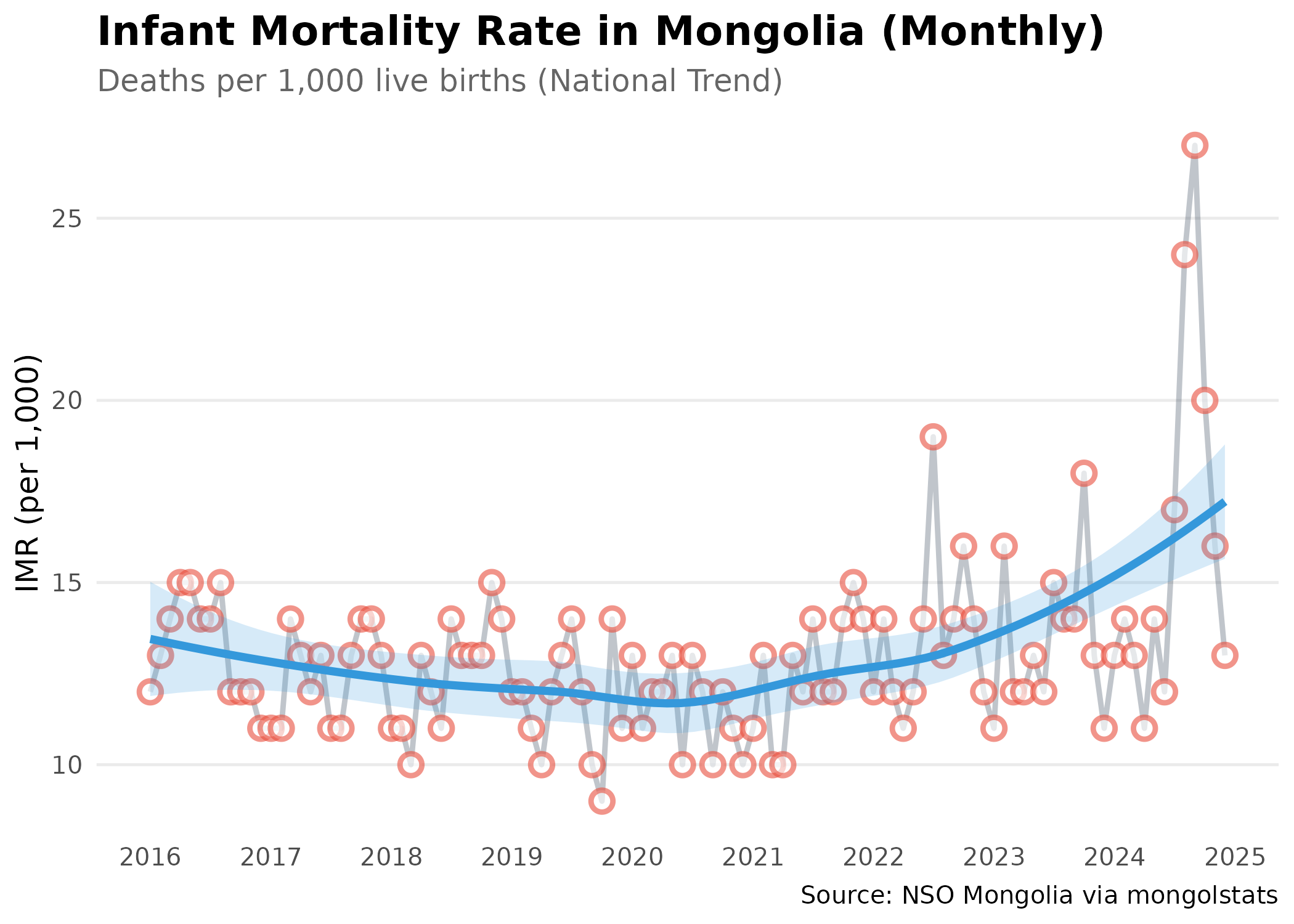
Regional Comparison
Compare infant mortality across different regions:
# Get all aimags for most recent year (2024)
# We'll take the average of monthly rates
months_2024 <- months |>
  filter(grepl("2024", label_en)) |>
  pull(code)

# Fetch IMR data for all regions in 2024
# We'll calculate the annual average from monthly data

imr_regional <- nso_data(
  tbl_id = "DT_NSO_2100_015V1",
  selections = list(
    "Region" = nso_dim_values("DT_NSO_2100_015V1", "Region")$code,
    "Month" = months_2024
  ),
  labels = "en"
) |>
  filter(nchar(Region) == 3) |> # Keep only Aimags and Ulaanbaatar (code length = 3)
  mutate(
    Region_en = trimws(Region_en),
    # Standardize region names to match geographic boundary data
    Region_en = dplyr::case_match(
      Region_en,
      "Bayan-Ulgii" ~ "Bayan-Ölgii",
      "Uvurkhangai" ~ "Övörkhangai",
      "Khuvsgul" ~ "Hovsgel",
      "Umnugovi" ~ "Ömnögovi",
      "Tuv" ~ "Töv",
      "Sukhbaatar" ~ "Sükhbaatar",
      .default = Region_en
    ),
    Type = ifelse(Region %in% c("1", "2", "3", "4"), "Region", "Aimag")
  ) |>
  # Calculate annual average IMR from monthly data
  group_by(Region_en, Type) |>
  summarise(value = mean(value, na.rm = TRUE), .groups = "drop")

# Top 10 highest IMR regions
imr_regional |>
  arrange(desc(value)) |>
  select(Region_en, value) |>
  head(10)
#> # A tibble: 10 × 2
#>    Region_en    value
#>    <chr>        <dbl>
#>  1 Hovsgel       27.2
#>  2 Arkhangai     24.8
#>  3 Övörkhangai   23.9
#>  4 Bayankhongor  21.6
#>  5 Ömnögovi      19.9
#>  6 Uvs           19.8
#>  7 Sükhbaatar    17.9
#>  8 Bayan-Ölgii   17.7
#>  9 Zavkhan       17.5
#> 10 Khovd         16.8
Visualize Regional Disparities
# Calculate national aimag average for reference line
aimag_mean <- mean(imr_regional$value[imr_regional$Type == "Aimag"], na.rm = TRUE)

p <- imr_regional |>
  filter(!is.na(value)) |>
  arrange(desc(value)) |>
  mutate(Region_en = forcats::fct_reorder(Region_en, value)) |>  # order bars by value, not alphabet
  ggplot(aes(x = value, y = Region_en)) +
  # Aimags get gradient fill to show relative severity
  geom_col(data = ~ subset(., Type == "Aimag"), aes(fill = value), width = 0.7) +
  # Regions (aggregates) get distinct dark color to differentiate
  geom_col(data = ~ subset(., Type == "Region"), fill = "#2c3e50", width = 0.7) +
  geom_text(aes(label = round(value, 1)), hjust = -0.2, color = "grey30", size = 3.5) +  # inline labels replace tooltips
  scale_fill_gradient2(
    low = "#27ae60",   # green = low mortality (good)
    mid = "#f39c12",   # yellow = average
    high = "#e74c3c",  # red = high mortality (concerning)
    midpoint = aimag_mean
  ) +
  geom_vline(xintercept = aimag_mean, linetype = "dashed", color = "grey50", linewidth = 0.5) +  # national average reference
  scale_x_continuous(expand = expansion(mult = c(0, 0.15))) +  # extra space for labels
  labs(
    title = "Infant Mortality by Aimag (2024 Average)",
    subtitle = "Dark bars represent Regional Averages; dashed line = national aimag average",
    x = "Deaths per 1,000 live births",
    y = NULL
  ) +
  theme_minimal(base_size = 12) +
  theme(
    plot.title = element_text(face = "bold", size = 14),
    panel.grid.major.y = element_blank(),  # horizontal gridlines clutter bar charts
    panel.grid.minor = element_blank(),
    axis.text.y = element_text(color = "black"),
    legend.position = "none"  # gradient is self-explanatory
  )

p  # print static ggplot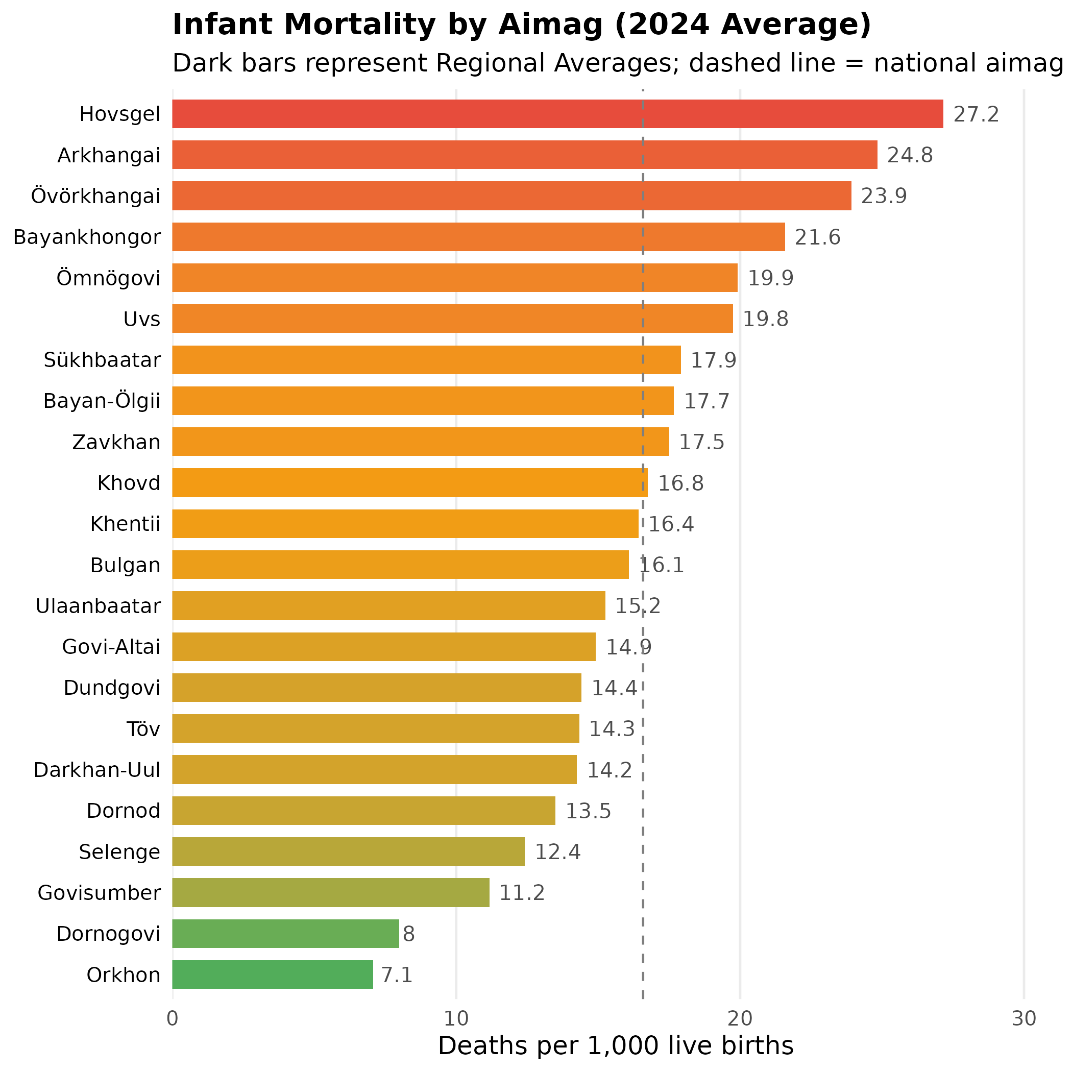
Adding Geographic Context
Combine with mapping for spatial analysis:
library(sf)

# Get aimag boundaries
aimags <- mn_boundaries(level = "ADM1")

# Join IMR data to map
imr_map <- aimags |>
  left_join(imr_regional, by = c("shapeName" = "Region_en"))

# Create choropleth map
p <- imr_map |>
  ggplot() +
  geom_sf(aes(fill = value), color = "white", size = 0.2) +
  scale_fill_viridis_c(
    option = "magma",
    direction = -1,  # dark = high values (high mortality), light = low
    name = "IMR\n(per 1,000)",
    labels = scales::label_number()
  ) +
  labs(
    title = "Infant Mortality Geography (2024 Average)",
    subtitle = "Spatial distribution of mortality rates",
    caption = "Source: NSO Mongolia"
  ) +
  theme_void() +  # remove axes for cleaner map appearance
  theme(
    plot.title = element_text(face = "bold", size = 16),
    plot.subtitle = element_text(color = "grey40"),
    legend.position = "bottom",          # bottom legend maximizes map width
    legend.title = element_text(size = 10, face = "bold"),
    legend.key.width = unit(1.5, "cm")   # wider legend key for continuous scale
  )

p  # print static ggplot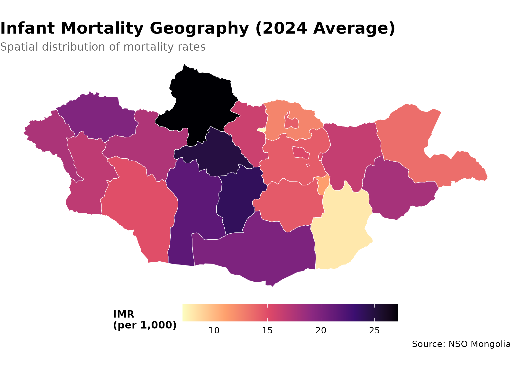
Key Functions Summary
| Function | Purpose | Example |
|---|---|---|
nso_itms_search() |
Find tables by keyword | nso_itms_search("mortality") |
nso_table_meta() |
Get table dimensions | nso_table_meta("DT_NSO_...") |
nso_dim_values() |
List dimension values | nso_dim_values(tbl, "Region") |
nso_table_periods() |
Check time coverage | nso_table_periods(tbl) |
nso_data() |
Fetch data | nso_data(tbl, selections, labels) |
mn_boundaries() |
Get geographic boundaries | mn_boundaries(level = "ADM1") |
Best Practices
-
Always use labels: Set
labels = "en"innso_data()for readable output -
Check metadata first: Use
nso_table_meta()to understand dimensions before fetching -
Use appropriate selections: Specify dimensions by
their English labels (e.g.,
"Total"not"0") -
Filter carefully: Exclude total rows (usually code
"0") when analyzing subgroups -
Clean labels: Use
trimws()to remove leading/trailing spaces from region names before joining
Next Steps
- Discover More Data: See the Discovery Guide for advanced search techniques
-
Create Maps: Learn spatial analysis in the Mapping Guide
- Reference: Browse all functions in the Reference